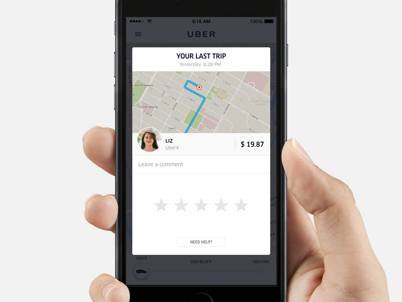
Rating on Uber
A couple of months ago we improved the old rating screen by making visual and interaction improvements to it. Instead of a fullscreen modal, the rating screen is now a card to keep riders within the context of the Uber experience.
We're always looking for great product designers, in Amsterdam as well: uber.com/jobs
View on DribbbleYou may find inspiring…
Sign in or create an account
New or returning users? Get started here.
Forgot your password? Reset here
By continuing, you agree with the Terms of Use and the Privacy Policy.


![10+ iPhone 17 and MacBook Mockups for Designers [2025]](https://assets.mockuuups.com/mo/image/upload/i7vw257c1pqpj6jjd9id)


